Journal
Composition that guides the eye
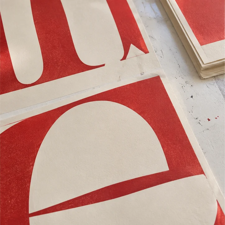
Set the reading order
On a poster, decide which information must be legible at a distance. Give the title, date and location distinct roles. Scale and spacing often do that work with fewer elements than three competing colours.
Check at actual size
Print a reduced version to compare relationships between blocks, then display a full-size proof. View it from where the audience will first see it. Reserve detail for close reading and repeat the test on a narrow screen.